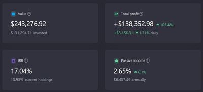
Here you can see two types of charts - Portfolio Value and Holdings Value.
Portfolio value
It shows the value of your portfolio from the very beginning of its existence (from the time of your first transaction). Your trades affect the value of the portfolio - when you buy something, the line goes up, when you sell something, the line drops.
For example, you bought 1 AAPL share on January 1, 2020, then bought 2 more AAPL shares on February 1, 2020. This means that the chart from January 1 to January 31 will show the cost of 1 AAPL share, and starting from February 1 - the cost of 3 shares.
How is it compared with the benchmark*?
To compare the profitability of the portfolio with the benchmark (fund), we take all your purchase and sale transactions and try to "buy" or "sell" the selected fund with the value of these transactions. That is, we calculate what would happen if you bought the shares of the selected fund only, instead of buying/selling assets in your portfolio.
For example, you bought 1 AAPL share on January 1, 2020 for $74. If you compare it with the S&P 500 (SPY), then we buy shares of the fund for $74, and get 74/296 = 0.4 pcs ( as the price of 1 share on January 1, 2020 is $296). Thus, we calculate how many fund units there would be in the portfolio throughout its existence and based on these data we estimate the historical profitability of your portfolio.
If benchmark asset pays dividends, additional shares of this asset are purchased for the dividends received from the asset.
Holdings value
It shows how your current portfolio has behaved over the past periods. In other words, if you currently have 10 AAPL shares in your portfolio, the line graph will show how much these 10 AAPL shares have been worth over the past 10 years (or 5 years, 1 year, 6 months, ...).
How is it compared with the benchmark*?
The historical profitability of your portfolio and the benchmark excluding your transactions is demonstrated in this comparison.
In order to compare the return on assets with the benchmark we should look at how much all current assets in the portfolio were worth 10 years ago (10 years is the maximum period the graph is plotted for, if you chose another period, e.g. 5 years, we will take a look at its cost over 5 years). For example, they cost $100. We "buy" units of a benchmark (fund) 10 years ago for $100 and then show how the value of the fund has changed over time.
* Popular index funds act as benchmarks
S&P 500 → SPY, SPDR S&P 500
NASDAQ 100 → QQQ, Invesco QQQ Trust
RUSSELL 2000 → IWM, iShares Russell 2000
FTSE 100 → ISF, iShares Core FTSE 100 UCITS ETF
DAX 40 → EXS1, iShares Core DAX UCITS (DE) ETF
CAC 40 → ETF, iShares MSCI France ETF
Nikkei 225 → 1329, iShares Core Nikkei 225 ETF
SSE Composite → MCHI, iShares MSCI China ETF
FTSE Global → VT, Vanguard Total Global Equities
MSCI World → URTH, iShares MSCI World ETF
MSCI Emerging = ETF, iShares MSCI World ETF
Vanguard = Vanguard, Vanguard Innovation Vanguard


