
Snowball Analytics is a service for retail investors that helps to plan and track your investments, monitor dividend payouts, and make effective investment decisions.
The main element of the service is a "Portfolio", which includes various "Holdings" distributed by "Categories". Each asset has "Transactions" and "Incomes".
Convenient data import from a broker
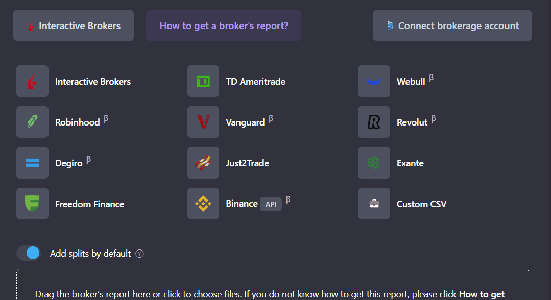
You can start working with the service by importing your transactions and holdings, which is best done by connecting your brokerage via Yodlee and Snaptrade, trusted cloud based account aggregators. Your data will be synced automatically.
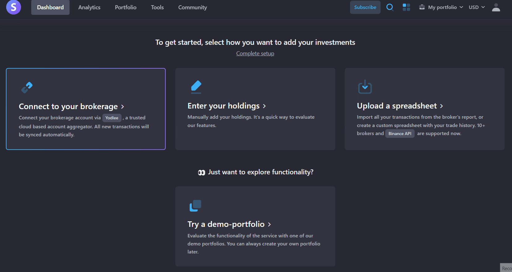
You can also import your brokers' report (if its supported) or create a custom CSV file with your trades history. We are constantly working to support as many brokers as possible, if your broker is not currently listed, you can contact us at help@snowball-analytics.com.
Asset types
At the moment the service supports many different types of assets:
- Stocks
- Funds and REITs
- Precious metals
- Currency (including full accounting of deposits, withdrawals, currency conversions)
- Custom assets (rent, deposit, etc.)
Set up your target allocations with our Categories
A category is a kind of "folder" for other categories and your holdings, which is created by the user when planning an investment portfolio. You can create an unlimited number of categories, fill them with holdings and set target allocations for both categories and holdings included in them. Each category or holding in the portfolio should occupy some target allocation, which depends on the investment period, goals and risk profile of the investor.
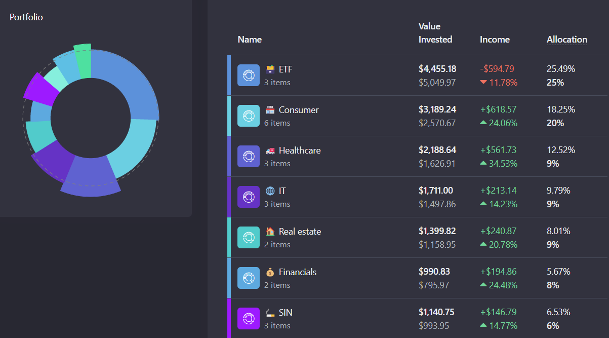
With the help of categories, you can plan and structure your investment portfolio, achieve the necessary diversification, and plan purchases. When creating a portfolio, the service can distribute current holdings into categories that correspond to sectors of the economy, and the allocations of holdings will reflect the current distribution (Go to Portfolio -> Categories, and click on Create categories from scratch button).
Dashboard
Portfolio is the root "folder" for categories and holdings, it can correspond to a brokerage account or includes several brokerage accounts and reflect the strategy (dividend portfolio, growth stocks). There can be several portfolios and they can be combined into a composite portfolio.
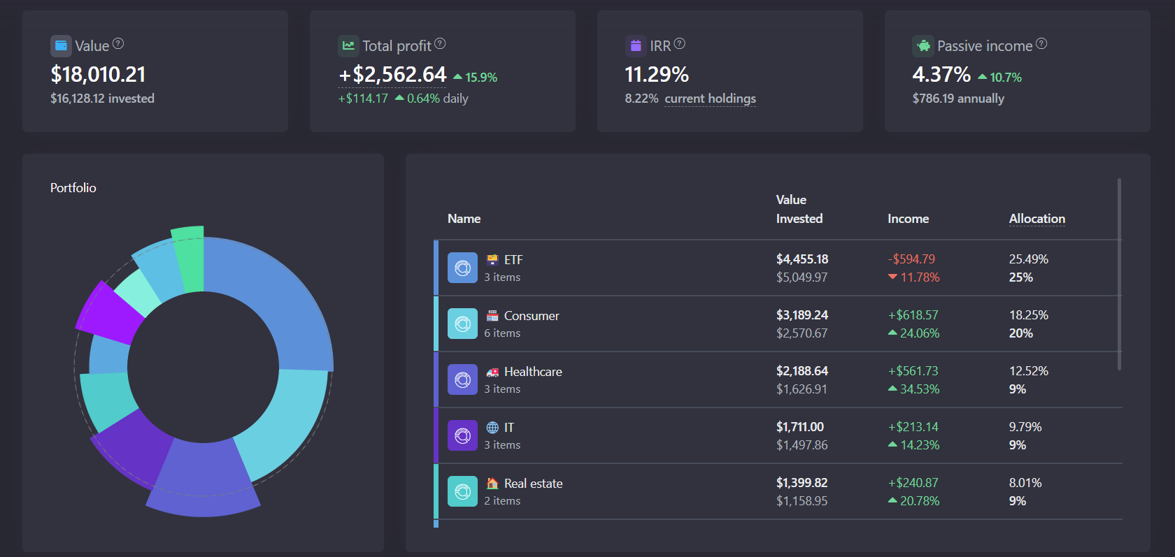
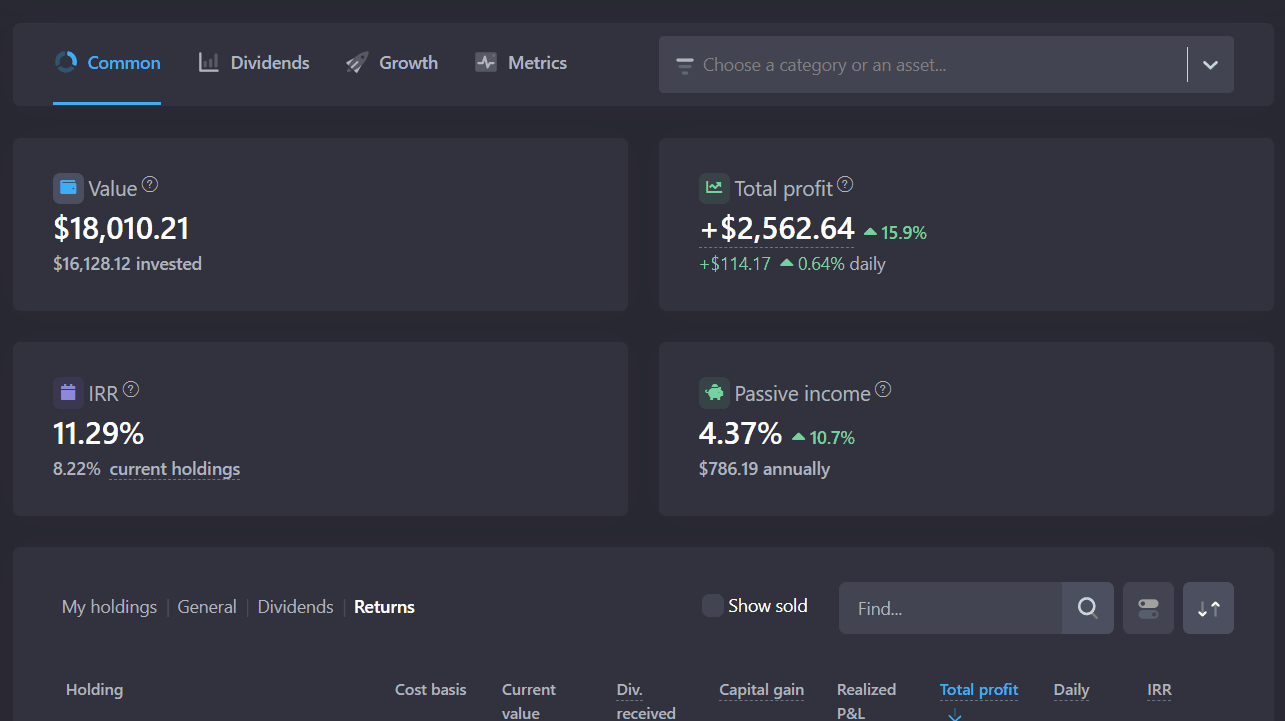
The main page provides general information about the status of the portfolio:
- Value - the current value of the portfolio in the selected currency
- Invested - the amount of purchases of all current (unsold) assets + currency
- Total profit, which includes dividends received, realized PL, fees paid and taxes on dividends for the entire lifetime of the portfolio
- Internal Rate of Return - net annual return earned by the investor over a period of time and calculated on the basis of the incoming and outgoing cash flows
- Passive income from dividends and regular payments. Only regular payments are considered (special dividends and one-time payments are not included). The yield (%) is displayed in relation to the current value of assets (excluding cash balance).
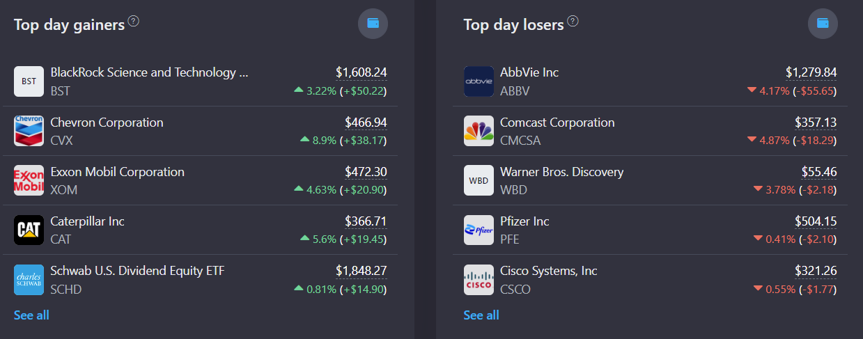
Next is a block with the composition of the portfolio, exchange rates relative to the base currency (displayed if the selected currency differs from the holdings currency), the top day gainers and losers.
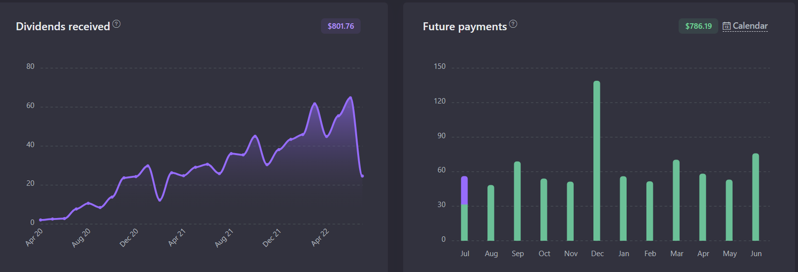
The graphs of the received dividends show how many payouts have been received for the entire existence of the portfolio. The information is taken from the imported transactions. Depending on the tax settings in the portfolio, the amounts can be displayed both BEFORE and AFTER the tax payment.
The graphs of future payments is forecasted and is based on information about current assets and forecasted payouts. Depending on the tax settings in the portfolio, the amounts can be displayed both BEFORE and AFTER the tax payment.
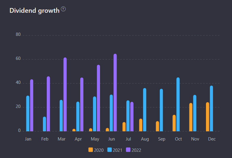
With the help of the dividend growth chart you can track the dynamics of dividend payments for the latest three years. You can trace the dynamics of dividend growth from year to year.
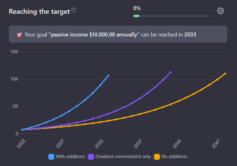
The Reaching the target chart evaluates the prospects for achieving the goal set for the portfolio (e.g. annual income) based on current profitability and growth indicators, as well as information about regular top up of the portfolio. All the necessary settings are available by clicking on the "Settings" button at the top right of the screen.
Common analytics
On the Analytics -> Common settings tab, the upper block from the main page is duplicated, but it has some additional functionality. Using the filter at the top of the page you can select the categories and holdings you are interested in.
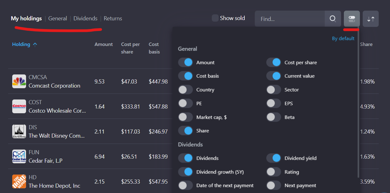
The "My holdings" table can be customized according to your needs. By clicking the icon on the right, you can switch or edit columns, and on the left there is an opportunity to select predefined tabs for general information on the holding, dividends and profits.
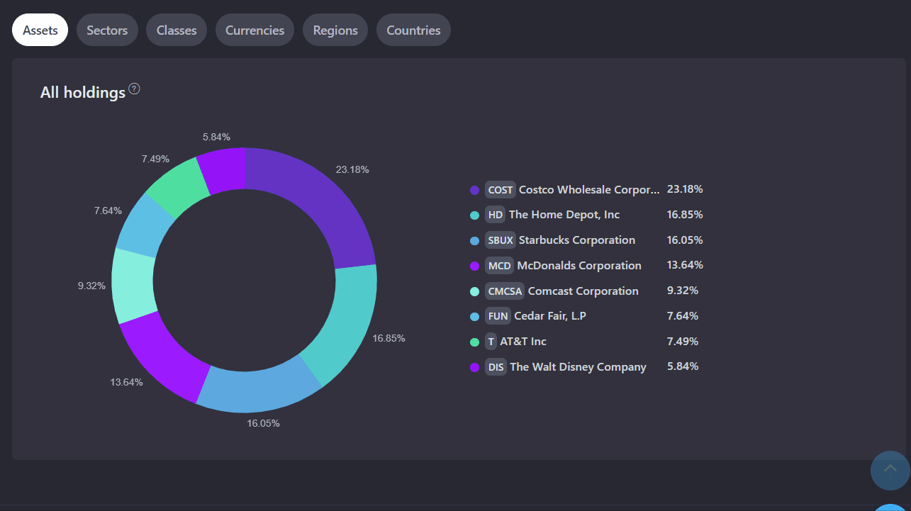
Below the table there is a block where you can find information about how the holdings are composed in your portfolio. On most of the tabs on the right side there are some additional display settings available.
Dividend Analytics
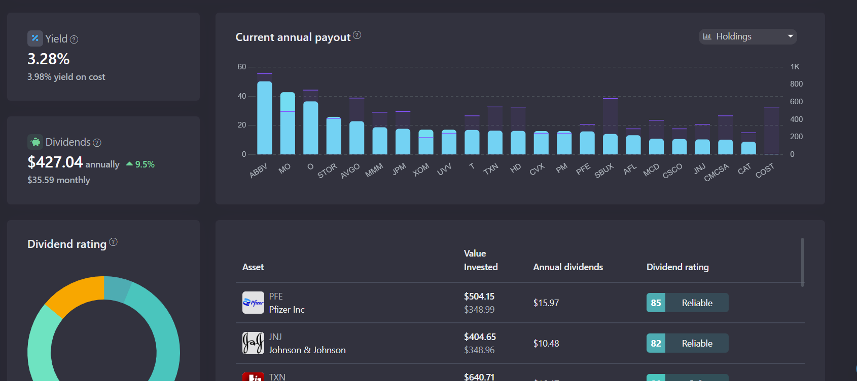
On the Analytics - Dividends tab you can find a detailed asset analysis from the point of view of the dividend investment strategy. The filter option is available and functions like the other tabs on the page. You can use this filter to have the analytics displayed only for selected holdings /categories.
The "Yield" block reflects the yield for the year ahead from the payment of dividends which come from the current value of the portfolio after taxes (specified in the portfolio settings). The returns before taxes and your revenue on invested capital are also indicated.
The "Dividends" block shows the projected profitability in monetary terms, the average annual growth of dividends, as well as the average amount of monthly payouts.
The graph "Current annual dividends" shows the ratio of current annual dividends to the capital invested in them - the blue column shows the amount of income, the purple column (dash) shows what amount of capital was invested into the asset, relative to the income. That means, the higher the blue segment and the lower the purple one, the higher the return on the asset on the invested capital. The graph is plotted for 35 holdings or categories with the highest dividends per year.
The "Dividend Rating" is a special metric calculated based on 13 fundamental parameters. It reflects the likelihood that the company reduces or cancels dividends based on its financial condition. The higher the number, the less likely it is to cancel or reduce the dividend.
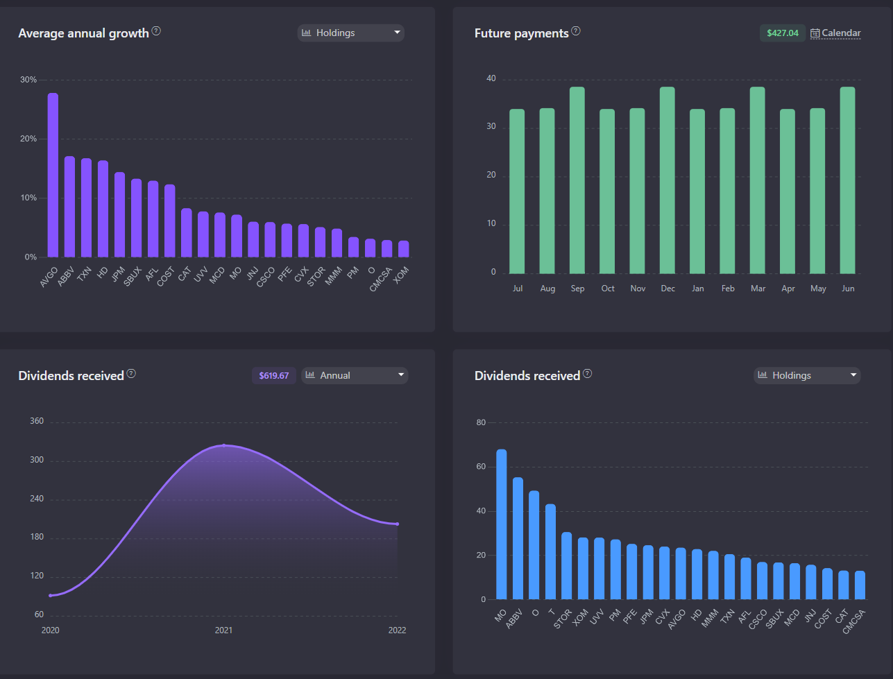
The "Average Annual Growth" graph shows the average annual growth of the company's payments over the past 5 years. You can build the graph both by holdings and by categories.
The "Future Payments" schedule reflects the announced and projected payments of companies for the year ahead. More detailed information about future payments is available in the Dividend Calendar.
Growth Analytics
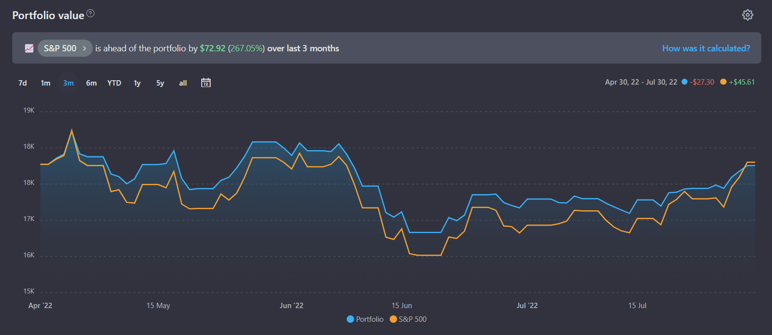
In growth analytics, the central place is dedicated to the portfolio value chart. It has several display modes and settings, including the ability to compare current values with a benchmark (index funds or any other asset):
- The "Portfolio History" display mode shows the value of your portfolio on the chart from the very beginning of its existence (from the first transaction). Your trades affect the value of the portfolio - when you buy something, the values go up, when you sell something, they go down.
Comparison with the benchmark in this mode is performed as follows: we take all your buy-sell transactions and "buy" or "sell" the selected fund for the total value of these transactions. That is, we imagine what would happen if, instead of assets in your portfolio, you chose to buy the shares of the selected fund. When the option Reinvestment of dividends is enabled, additional shares of this fund are purchased for the amount of the payouts received.
- The "Assets History" display mode shows how your current portfolio behaved in the past. In other words, if you currently have 10 AAPL shares in your portfolio, it will show how much 10 AAPL shares have been worth on average over the past 10 years (or 5 years, 1 year, 6 months, ...).
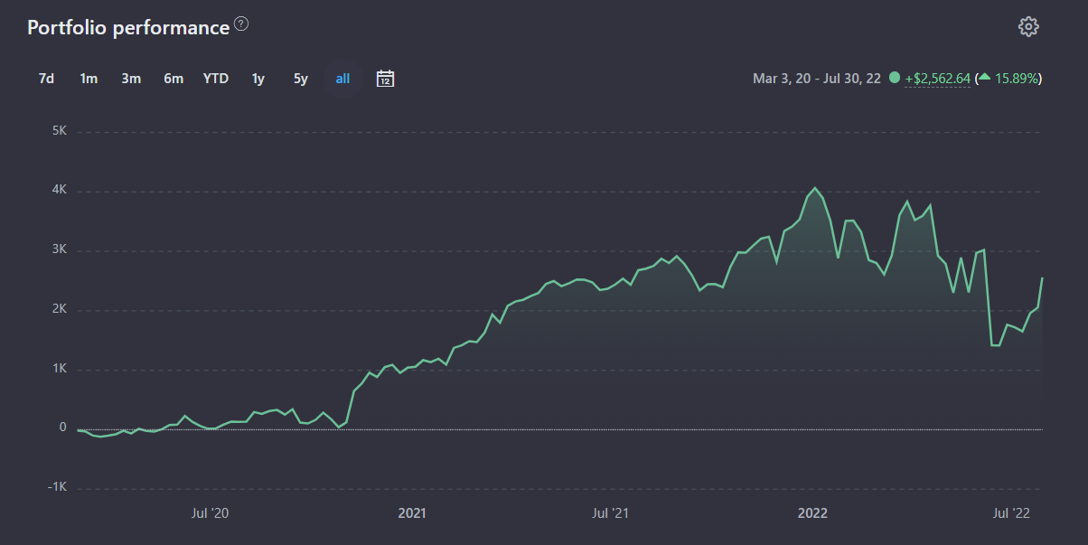
The Portfolio performance chart shows the total profit of the portfolio throughout its history, and you can also view the profit for any period. The profit for the period is calculated relative to the value of the portfolio at the end of the previous day. Grouping by categories and by source of profit (capital gain, dividends, realized PL, etc.) is available in the settings.
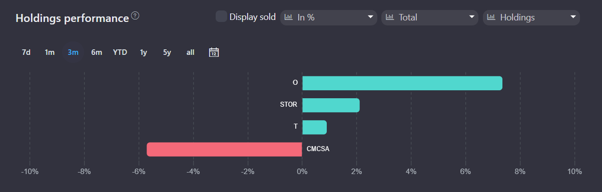
The Holdings performance graph allows you to track which holdings /categories bring the most profit (or loss) as a percentage or in absolute values for an arbitrary period of time.
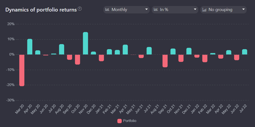
The Dynamics of portfolio returns graph shows the profitability of the portfolio by year/month. Here you can track the dynamics of your portfolio profitability or its individual categories in percentages or in absolute values. This graph allows you to identify categories that affect the value of the portfolio in specific periods of time.
Portfolio Metrics
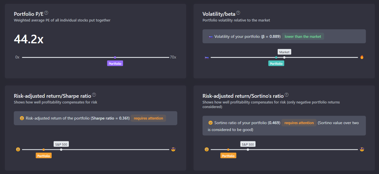
The Analytics - Metrics tab contains the main indicators of the portfolio, thanks to which you can quickly assess the risk-return ratio of the portfolio. A filter is also available on this tab, so you can view metrics for individual assets and categories.
P/E shows the weighted average ratio of the value of the shares of companies in the portfolio to their profits.
The Beta coefficient (volatility) shows the degree to which the price of an asset or an entire portfolio depends on the overall market dynamics measured by a broad market index — for example, the S&P 500.
The Sharpe ratio is an indicator of the effectiveness of an investment portfolio (asset), which is calculated as the ratio of the average risk to the average portfolio deviation. It is used to determine how well the return on an asset compensates for the risk taken by the investor. The S&P 500 (SPY) fund is used as a benchmark. As a risk-free asset we use the yield of 5-year US Treasury bonds.
The Sortino ratio is an indicator that allows you to assess the profitability and risk of an investment instrument, portfolio or strategy. It is similar to the Sharpe coefficient, but this indicator considers only negative fluctuations in profitability.
Dividend calendar
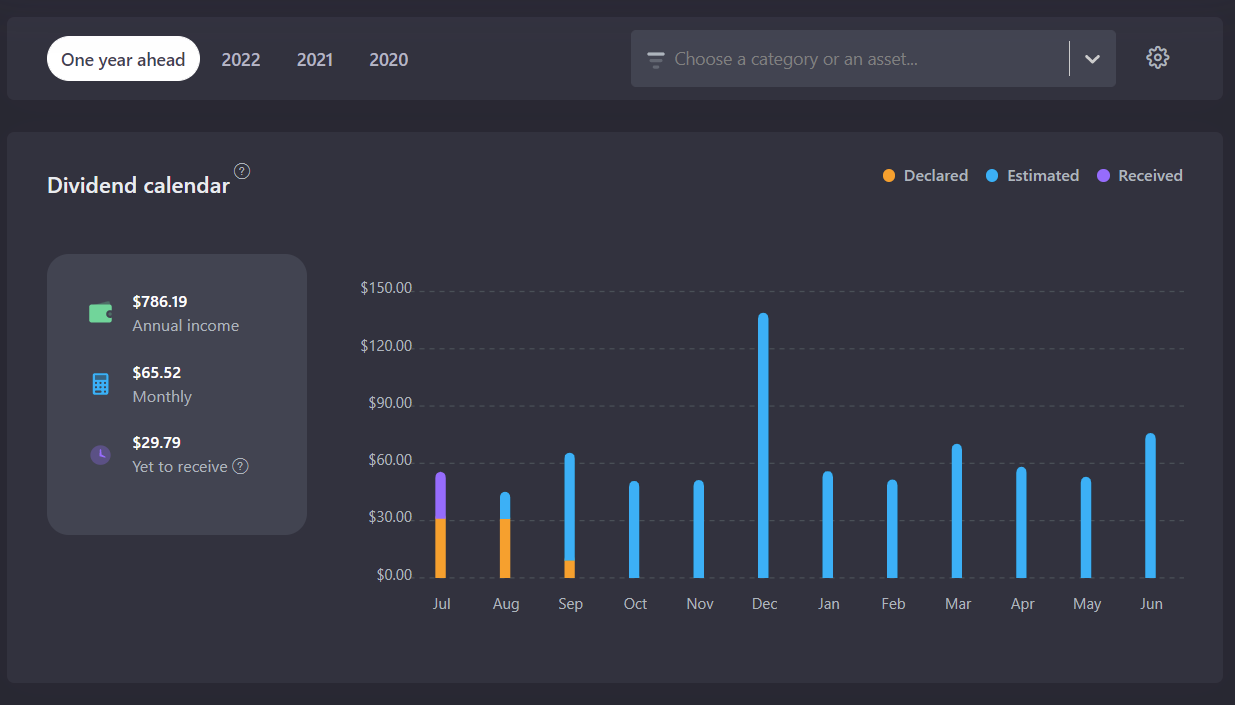
In the "Dividend Calendar", future payments are calculated based on information about declared dividend payments or past dividend rates of the company. For coupon payments the calculation is based on information about the frequency of payments.
Please note! The date of actual payouts to your broker's account may differ from the one stated as it depends on your broker. If the dividends have the Estimated status, it means that we have calculated the approximate payment date based on past payments. This means that the dates and the amount of payments are approximate and may change.
Depending on the tax settings in the portfolio, the amounts can be displayed both BEFORE and AFTER the tax is paid.
Cash tracking
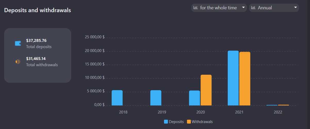
Cash tracking option is available for all portfolios - "Current balance only" or "All movements". Cash tracking can also be disabled for the portfolio.
In the "Current Balance" mode, the currency balance is imported from brokers' reports and accounted for as part of the portfolio. Currency transactions - deposits, purchases, sales, etc. are not created. This mode is convenient if you consider the currency to be part of the portfolio.
In the "All movements" mode, all currency movements in the portfolio are considered including deposits, withdrawals, currency conversions, etc. This allows you to track the statistics of deposits and withdrawals. What’s more, in this mode returns are calculated more accurately due to the fact that conversion transactions are considered.
Company page
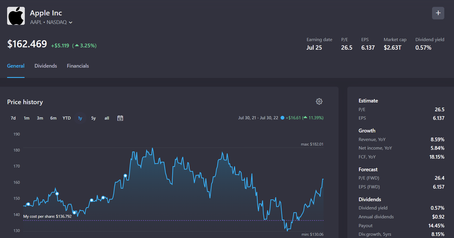
When you click on a holding in the portfolio, you can go to the page with detailed information about the company or fund. The general tab provides brief financial information on the asset, a price chart and information about transactions in your portfolios.
The dividends tab provides detailed dividend analytics, payment history in tabular and graphical form. The YTM dividend yield chart shows the ratio of the current share price to total payouts over the past 12 months, which makes it possible to estimate the change in the value of the company in terms of its dividend payments.
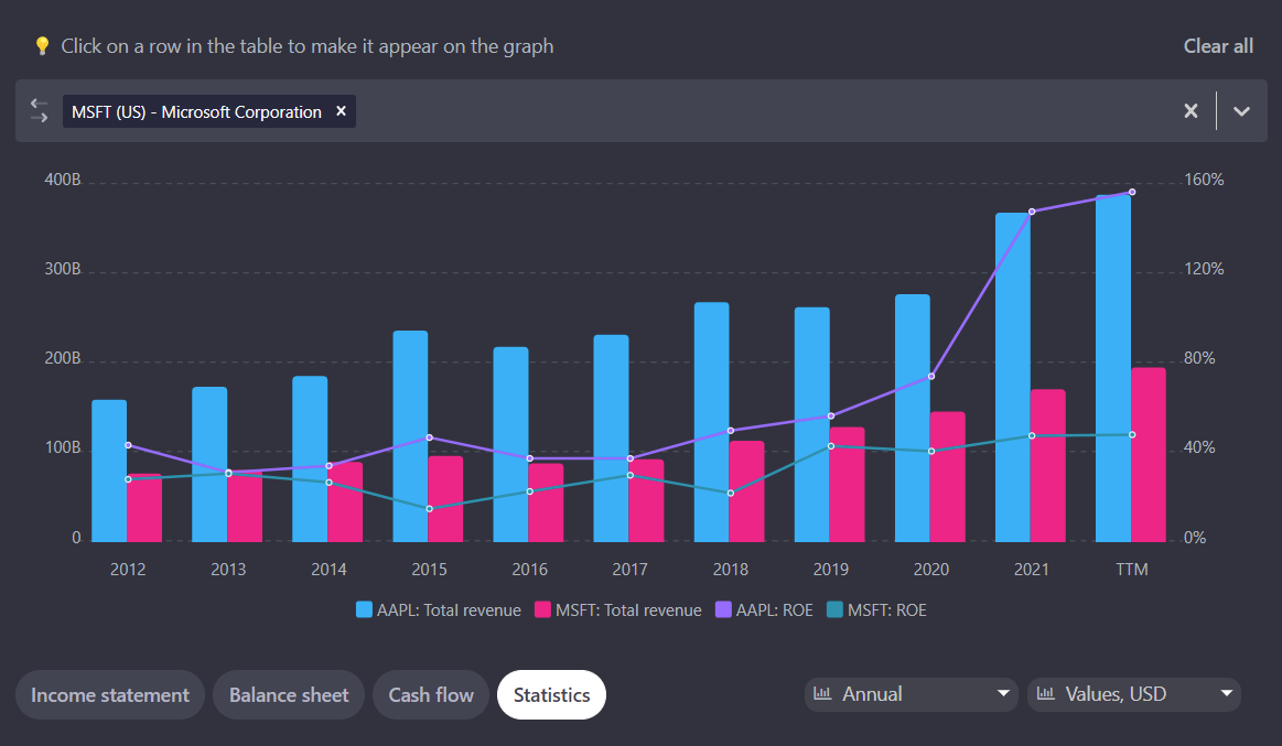
The financials tab contains information about the company's financial indicators for the last 10 years. You can select any rows in the table and display the values on the graph, and also at the top of the graph there is a field for selecting companies for comparison by the indicators you decide to choose.
Portfolio rebalancing
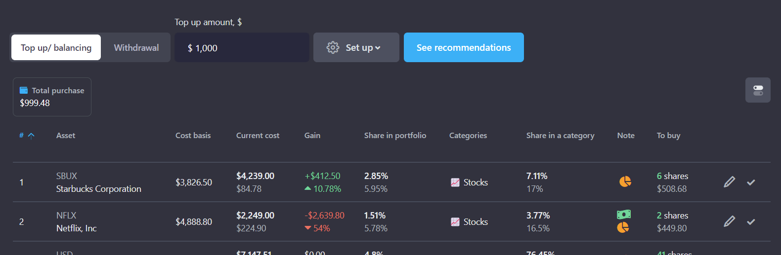
The Portfolio rebalancing tool helps to plan purchases and rebalance your portfolio. Based on the target allocations of categories and holdings in the portfolio, we suggest which assets to buy to keep your portfolio balanced. The tool is especially useful to top up the portfolio regularly.
Using the settings, you can balance the portfolio to a certain amount, calculate the necessary amount of top up payments for balancing a certain category, or plan to sell some assets for partial withdrawal of funds from a brokerage account.